DOUGLAS E DRAPER JR
  • POSTS
  • ARTWORK
  • ABOUT
  • PURCHASE
  • CONTACT
  • POSTS
  • ARTWORK
  • ABOUT
  • PURCHASE
  • CONTACT
Search

Four Courses With JB Smoove | Drawing, The Third

3/2/2016

0 Comments

 
Picture
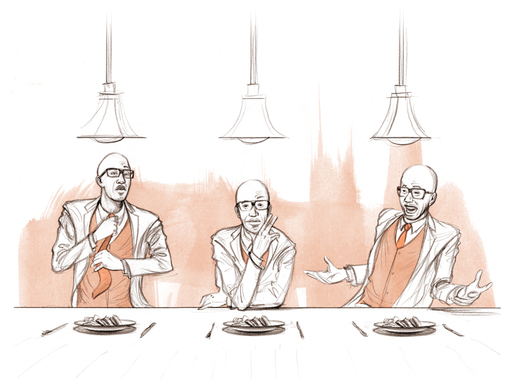
Here we have the 3rd drawing in my short series for the TV show, Four Courses With JB Smoove.

JB is an extremely upbeat entertainer. He exudes high energy and uses his body, as well as a plethora of facial expressions, to communicate his comedy. Running with this idea we decided to have a drawing emphasizing this characteristic, displaying each expression while sitting before a meal.


If you'd like to find out more about the show you can visit MSG Network here.

Hope you enjoy. I'll have the next drawing posted tomorrow.

​D
0 Comments

Four Courses With JB Smoove | Drawing, The Second

2/25/2016

0 Comments

 
Picture
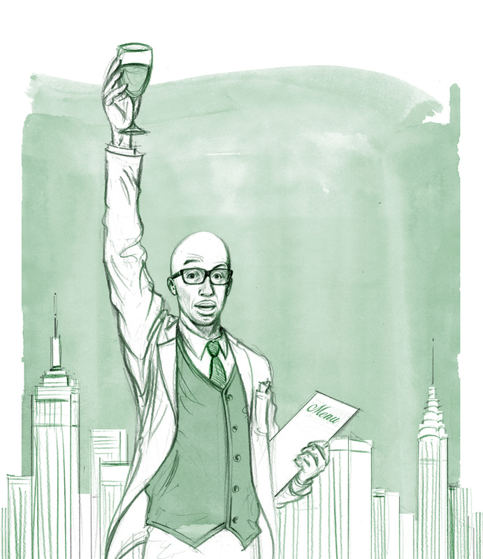
Here we have the 2nd drawing in my short series for the show, Four Courses With JB Smoove.

Since the show takes place in New York this piece is meant as a play on the Statue of Liberty. JB himself is playing as stand-in for the grand ole' lady - the menu in place of the tablet she holds and the glass of wine as a substitute torch. This is why that classic pale green was chosen for the ink wash - to match the patination that's occurred to the copper hanging over the statues' frame.

I also wanted the New York skyline resting in the background, but it needed to be recognizable as the Big Apple so we included the Empire State Building and Chrysler building.

Quick Side Story: A number of years ago I worked in NY as a temp. I worked here and there and moved from place to place, as temps do. Then one day I realized I'd been working in the Chrysler building for about a week. I guess I'd become acclimated to the city since I never took the time to look up when walking on the street.  I had no idea. New York. Funny place.


Hope you enjoy. I'll have the drawing numero tres posted next week.

​D
0 Comments

Four Courses With JB Smoove | Drawing, The First

2/23/2016

0 Comments

 
Picture
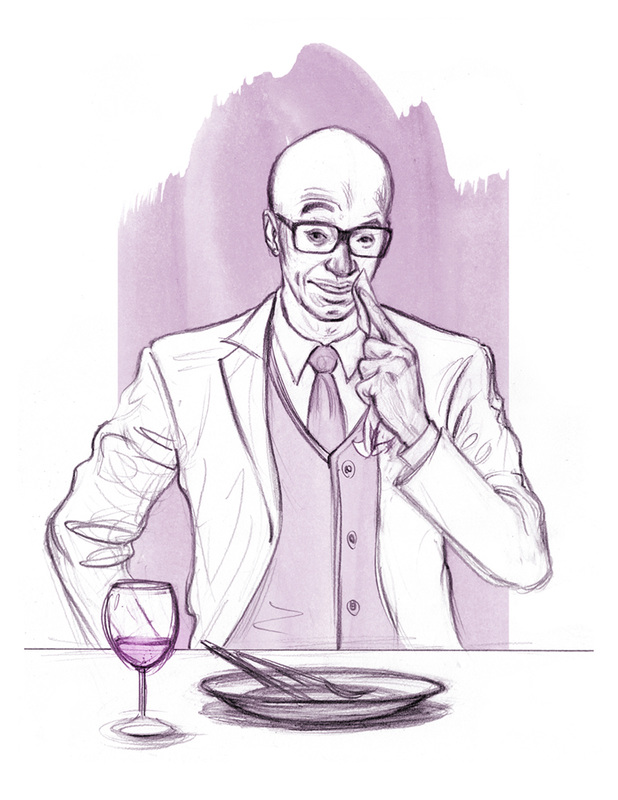
This is the first in a short series of drawings done for the TV show, Four Courses With JB Smoove. JB, if you're not aware, is a high energy uber funny comedian. I first came across him in the Louis CK film, Pootie Tang back in my MICA days (thank you James Favata). He acted in and narrated the movie. Check it out if you haven't. You'll love it or hate it. He's also hosted Last Comic Standing and guest-stared on Louie CK's show, Louie.

My art director, Masha of Plastic Palm Tree, approached me with the project and I was more than excited to do it. The premise of the show is pretty straight-forward: JB sits down with celebrity friends and chews the fat. These sketches were used as concept pieces. Kind of 'visual ideas' to communicate a particular direction for the marketing campaign. The show and JB are light-hearted so that was a clear goal - to get across JB's personality and the show's tone. So in this piece we have him just finishing a meal, then wiping his mouth while wearing a comical smirk.

If you'd like to find out more about the show you can visit MSG Network here.

Hope you enjoy. I'll have the next drawing posted on Thursday.

​D


0 Comments

Hot Chocolate and Snow | Slideshow

2/11/2016

0 Comments

 
It snowed again here in Philly this morning, just briefly, but enough to inspire me to post the process of making the Cooking w/ Kyler winter scene.

Here's a step-by-step slideshow showing each stage from sketch to final.

Hope you enjoy.

D
0 Comments

Hot Chocolate and Snow

2/10/2016

0 Comments

 
Picture
It snowed last night here in Philly so I thought I'd share a little winter fun via Cooking with Kyler. Check out their always educational and always fun videos right HERE.

Fun Fact: This piece was actually drawn on two separate pieces of paper. On the first was a linear pencil drawing outlining the illustration, and on the second was an ink wash to build the forms and shadows. I then merged them together using Photoshop, where I also colored and lettered it.

Cheers,
Doug
0 Comments

Candy Canes, Stockings and Cooking

12/23/2015

0 Comments

 
Picture
Hey there,

Hope everyone's having a wonderful holiday season. I'm about venture south this evening to visit the family for Christmas. Before doing so though I thought I'd share a festive little piece done for Cooking With Kyler, the YouTube cooking channel (check it out right HERE). This was created with a combination of pencil, dry brush and ink wash technique, and lastly Photoshop.

Hope you enjoy and I'll talk with you soon.

​Doug
0 Comments

Room 237

12/14/2015

0 Comments

 
Picture
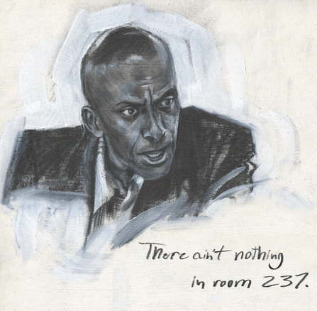
Lastly in the series we have Dick Hallorann, played by Scatman Crothers. One can't help but feel the sensitivity of this guy. The variety of emotions that shine through his expressions is always really enjoyable to watch. In this particular scene I think he uses them all. Even within a single sentence he'll use 3 or 4 expressions. Just watch how much his brow moves. Up and down, in and out.

In this scene it's said that Crothers actually broke down into tears because of the number of takes Kubrick demanded of them. It was an exhausting project for Scatman and I think the honesty of that exhaustion came through in his scenes. Then again I'm not an actor, so I can only speculate. But I do enjoy his character and it's interesting to ruminate on where the real world of being a working actor blurs with the fictitious world of your character.

Hope you enjoy the drawings. I'll be back with more new work, as well as some pieces I've been meaning to post.

D
0 Comments

No Sir, Not Busy At All.

12/11/2015

0 Comments

 
Picture
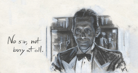
Perhaps the most memorable secondary character from The Shining and yet he has just two scenes and maybe, maybe a dozen words. In fact, he barely even moves. Yet the presence of Lloyd the bartender is undeniable. That dead-on unblinking stare and unwavering smile leave us with an odd and unsettling feeling. But I can't help but love Lloyd. I've got two 10's and two 20's right here.

​Next up: Dick Hallorann

D
0 Comments

Fine

12/9/2015

0 Comments

 
Picture
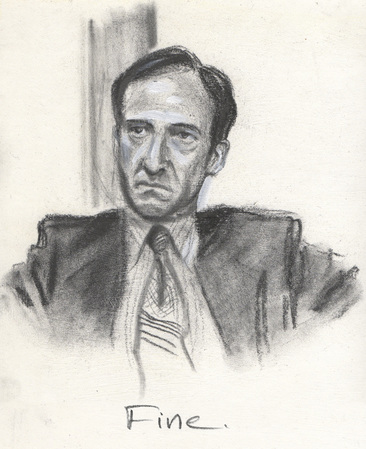
Bill Watson has one of the smallest roles but he's so peculiar and quirky that I can't look over him. One of the things that always gets me thinking about his character is the way he delivers his very last line, "fine".

Him and Stuart Ullman are walking down the hallway of the Overlook and if you listen carefully you can hear them discussing plane flights and departure times. Everyone's leaving the hotel for the winter. They approach Jack, who has a massive pile of luggage next to him. Mr Ullman asks Jack about lunch and then turns to Bill and asks him to help them with their luggage.

The way Bill replies with "fine" always peeks my interest. There's some contempt behind it. It's probably due to the plane flight and his eagerness to leave. But considering the strangeness of the rest of the film one can't help thinking maybe it's something more.

He says the same word "fine" earlier as well during their meeting with Jack. And it has a similar tone but slightly less disgruntled. One day I'll figure out what's up with this guy. One day.

Next up: Lloyd.

D
0 Comments

...Completely Normal Individual...

12/7/2015

0 Comments

 
Picture
Hey there,

I didn't get a chance to post the rest of my supporting character portraits from The Shining so I thought I'd get this show on the road again.

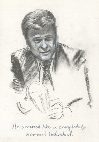
There's a lot of distinguishing characteristics of Barry Nelson's character, Stuart Ullman. He comes across as a very honest character. His subtle mannerisms, how he holds himself, his friendly smile, and I love how he fiddles with his fingers as he tells Jack the story of Mr. Grady. And of course that hair, gotta love the guy's poofy hair.

Like the previous drawings this is done on primed Rives BFK and is drawn with a graphite drafting pencil and woodless pencil. The papers' texture is actually rather rough so the graphite just sits on the surface almost like charcoal. You could almost blow it away with a strong exhale. But it gave the paint something to absorb so I liked that effect. Hope you enjoy.

Next up is probably the smallest and least recognizable character, but a fave of mine. Bill.

D
0 Comments

Halloween in the Kitchen

10/31/2015

0 Comments

 
Picture
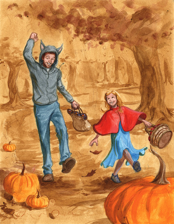
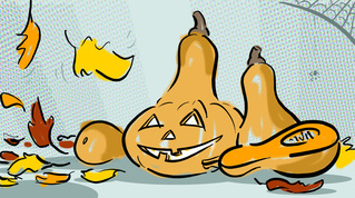
Just wanted to post a little illustration to celebrate the reason for the season. This is a piece done for the good folks at Cooking With Kyler. CwK is a YouTube channel starring Will (dad) and Kyler (daughter) that regularly posts fun cooking videos that anyone with a whisk and the will can take part in. They're goal: getting in the kitchen with the wee ones and making some tasty food.

​If you'd like to check out their latest Halloween-themed video on butternut squash soup click HERE. Btw, below is a cartoon I did for that video. Did you know in New Zealand they call butternut squash 'pumpkin squash'? Craziness.

Happy Halloween everyone!
Picture
0 Comments

I Corrected Them, Sir.

10/27/2015

2 Comments

 
Picture
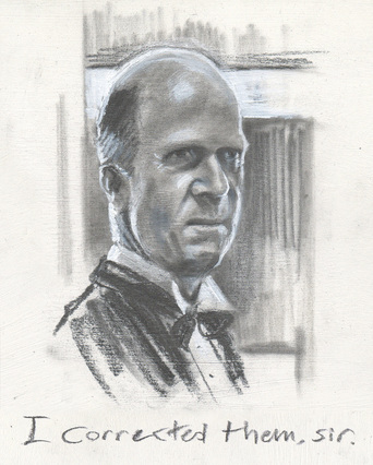
The Shining without a doubt makes my top 5 favorite horror films, if not the number one spot. This is due in large part to the excellent performances of the all the actors. Right down the line everyone is fantastic, engaging and memorable. Each scene has a quality to it that makes rewatching, and rewatching, and rewatching still enjoyable even to this day.

Another of the many reasons I love this film so much is that I never feel I fully understand it. So I return each viewing trying to discover a new clue.

To celebrate the film, or maybe my own confusion, I thought it would be fun to illustrate a few of the employees of the snowbound Overlook Hotel, and in particular the smaller roles. In this case it's one Mr. Delbert Grady, the once caretaker but now eternal waiter at that fine establishment.

This scene with Jack Torrance in the "gentleman's" room lingers in the memory for many reasons (the red walls, the pacing) but for me it's Philip Stone's portrayal of Mr. Grady... "I corrected them, sir". Great, great stuff.

Hope you enjoy and I'll talk with you soon,

Doug
2 Comments

"The Blackest Eyes... The Devil's Eyes"

10/26/2015

0 Comments

 
Picture
You can't have Halloween without Michael Myers so I thought I'd try my hand during one of his brief unmasked moments. This is one of the few shots, and the only shot in the first Halloween film, of that memorable mug.

There's something unnerving about it that always grabs my attention. Obviously there's the urge to see something that's been purposely hidden from us like a secret. But there's also the way it comes off in such a sudden, realistic way. And too, there's the chance to see what Loomis describes in an earlier scene; "The blackest eyes... the devils eyes". Either way, even if the movie's running in the background I'll aways stop what I'm doing, and turn around just for a peek.

Hope you enjoy and I'll talk with you soon,

​Doug
0 Comments

Crazy, am I?

10/23/2015

0 Comments

 
Picture
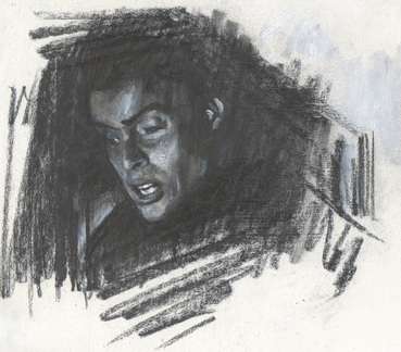
Being that it's almost Halloween I've found myself trying to get in the spirit of the holiday season. One of the ways I've done this is by partaking in a number of horror films, both new and classic. As you can guess the original 1931 Frankenstein made the list.

One of my favorite shots is of Henry (or is it Victor?) Frankenstein himself. I think it's likely the scene that depicts his lack of sanity the best, while ironically claiming the exact opposite. So I couldn't help but try to capture this. It's just such a great shot - and line.

This drawing is done in graphite, both with a woodless graphite pencil and a Staedtler mechanical drafting pencil. The surface is a gessoed piece of Rives BFK. Instead of using an eraser for highlights I opted to use white acrylic paint. When I scanned it the scanner warmed the paper and cooled the paint. The whites in the original are a bit more neutral, but I dig the push between the temperatures so I left it as is.

Hope you enjoy and I'll talk with you later,

D
0 Comments

In The Light Of The Skeletal Moons

10/22/2015

3 Comments

 
Picture
Hello, hello, hello fine people,
 
Halloween is before us which seems an appropriate time to reawaken the blog from its long relaxing slumber. Doing so with something frightening seems equally as appropriate. Gets the blood flowing.
 
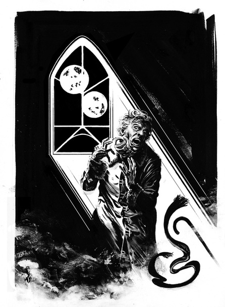
This is a piece for the short story titled “In the Light of the Skeletal Moons” (great title, am I right?) and is written by one Mr. Samuel Marzioli (visit his blog HERE). You can find both story and illustration within the sci-fi, horror pages of Space & Time magazine issue #123.

This piece was particularly fun in regards to content (aside from that creepy, protruding eyeball). My illustrative work has a reputation for the representational. However, this time around I wanted to try dipping my toes into symbolism with respect to the depiction of the cascading light and "skeletal" moons - a more graphic, simplistic approach with less realism.

Special Insider Note: this is actually Skeletal Moons v2.0. I had some areas I wanted to work on further so I went back after publication and created what you see here. You'll have to pick up S&T 123 to get a glimpse of version 1.0 .

Hope you enjoy and I'll talk with you later,

Doug

3 Comments

ADRIFT | "Abduction Chamber"

10/24/2012

1 Comment

 
Picture
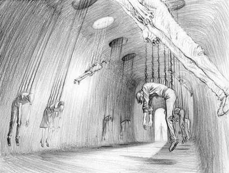
Since Halloween is right around the corner I'm going to continue onward with my more spine-tingling imagery. And the scene from ADRIFT that this concept piece is inspired by is easily the most frightening of the story.

This is the "Abduction Chamber". Originally a form of generator room which has now been revamped to harness energy from a new source. Humans.  Each captive is attached via their spine and as the energy is extracted their bodies are left ridged while pulled upwards toward the ceiling.

Not exactly my kind of hobby, but hey, that's me.

- D

1 Comment

MAD Magazine's Alfred E. Newman

10/3/2012

0 Comments

 
Picture
We've begun our journey into easily one of the best times of the year.  The month of October.  Leaves are changing, a brisk chill is in the air and, of course, there's Halloween.  Because of this I'm that much more excited to post this piece - a birthday commission for the son of a good friend of mine.  A painting of Alfred E. Newman.

This is in fact the first time I've ever illustrated the infamous character from the long-running and just as infamous, MAD Magazine.  And having the request to "zombify" him made it all the more enticing.

Being that he's a zombie I found the consistency of paint, and in this case acrylic paint, can coincide rather well with the texture of skin.  And skin that's, we'll say, not quite so fresh?  Even better.  One can loosen the grip on the brush more and allow the brushstrokes to just paint it themselves.

Having never illustrated Al prior the more I studied him the more character features began to emerge consistently from cover after cover of MAD.  Extremely specific features.  From the his well-known smirk & freckles to his slightly less obvious off-center eye. Something I hadn't picked up on before.  The guy's a peculiar subject.  But a consistently peculiar subject, I'll give him that.


I'm also excited to announce I've done something with this piece that I've NEVER done with any other piece of artwork.  Though you'll have to wait to find out what that is.  Don't fret though, I'll keep you posted.

Anyways, hope you all dig it (especially Cobey) and I'll talk with everyone soon!

- D
0 Comments

Pen & Ink Rendering | Towson Home

9/24/2012

2 Comments

 
Picture
Whatsup everyone!

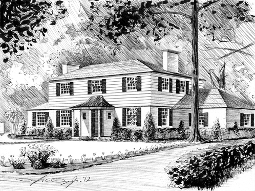
Continuing my experimentation with the pen & the marker I've recently wrapped up this pen & ink rendering of a home in Towson, Maryland.

What I found most interesting about this project was the return to the fundamentals of perspective.  After learning the rules I find it's quite fun to break them.  So much of the time I freehand the perspective, giving an image a looser organic feel. With this piece though it's more about a grounded solidified appearance to the image.

So to achieve this I decided to revisit those basic mathematical rules of perspective.  Which meant the horizon line, vanishing points and breaking out the ruler.  I also, for the most part, tried to keep the rendering to that of hatching (marks moving in the same direction), with minimal areas of cross-hatching (marks layered over one-another in opposite or various directions).  This gives off the feeling of a "traditional" pen & ink appearance, almost similar to that of an etching.  Though I still wanted those deep blacks so I used a calligraphy marker to create the foliage in the trees and bushes, also a way to help frame the home.

Hope you enjoy and I'll talk with you soon!

- D
2 Comments

SHO | Bio Illustration

9/17/2012

1 Comment

 
Picture
Whatsup everyone!

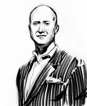
Here we have an illustration I did for the company, Social Help Online, a company geared around the wide world of Social Media.  This fellow's name is Lindsey Nagy, advisor to SHO and managing director of Nagy Ventures.

I did this piece in the similar manner to that of my most recent comic, Last Caress - using a variety of pens with black ink & white paint markers.  The results from creating artwork from basic office supplies can be rather surprising and a fun step outside the norm.  Especially if you've been wed to the brush like yours-truly.  For example, the pinstripe suit was done using a large Marks-A-Lot black permanent marker.  The thinner lines were used with a Staedtler pigment liner (drafting pen) and the shadows created with a smaller Marks-A-Lot marker that was on it's last leg.  You can get some nice grays with these.

Oh, and no worries, despite his slight resemblance to Lex Luther Lindsey's a good guy.  No need to fear world domination that I know of.  Hope you enjoy and I'll talk with you soon!

- D

1 Comment

Shore Pix | Logo Design

8/29/2012

4 Comments

 
Picture
Whatsup everybody,

Here's a logo I've recently designed for the new company, SHORE PIX.  Shore Pix is an establishment on the Eastern Shore of Maryland built around the digital preservation, as well as organization, of photographs new and old.

Over the course of my time designing logos I've really become quite found of these types of projects.  They're challenging in ways that help your eye understand the subtitles of "design", font selection, color and so on, which can be a slight step outside the peripheral of that of your illustrative or fine art eye.

Hope you enjoy and I'll talk with you soon!

- D

4 Comments
<<Previous

    Categories

    All
    Art Shows & Exhibitions
    Awards & Recognitions
    Childrens Books
    Conventions & Signings
    Film & TV
    Illustration
    Interviews
    Painting
    Panels & Workshops
    Process
    Reviews
    Sequential Art


    Archives

    May 2025
    April 2025
    March 2025
    February 2025
    January 2025
    December 2024
    November 2024
    October 2024
    September 2024
    July 2024
    June 2024
    May 2024
    April 2024
    March 2024
    October 2023
    February 2022
    November 2021
    August 2021
    July 2021
    June 2021
    May 2021
    April 2021
    March 2021
    February 2021
    January 2021
    November 2020
    October 2020
    September 2020
    August 2020
    July 2020
    June 2020
    May 2020
    April 2020
    March 2020
    February 2020
    January 2020
    December 2019
    November 2019
    October 2019
    September 2019
    August 2019
    July 2019
    June 2019
    May 2019
    April 2019
    March 2019
    February 2019
    January 2019
    December 2018
    November 2018
    October 2018
    September 2018
    August 2018
    July 2018
    June 2018
    May 2018
    April 2018
    March 2018
    February 2018
    January 2018
    March 2016
    February 2016
    December 2015
    October 2015
    October 2013
    May 2013
    April 2013
    February 2013
    December 2012
    November 2012
    October 2012
    September 2012
    August 2012
    July 2012
    June 2012
    May 2012
    April 2012
    March 2012
    February 2012
    January 2012
    December 2011
    November 2011
    October 2011
    September 2011
    August 2011
    July 2011
    June 2011
    May 2011
    April 2011
    February 2011
    January 2011
    December 2010
    November 2010
    October 2010
    September 2010
    August 2010
    July 2010
    June 2010
    May 2010
    April 2010
    January 2010
    December 2009


    ​© 2025 Douglas E. Draper Jr.
Powered by Create your own unique website with customizable templates.
  • POSTS
  • ARTWORK
  • ABOUT
  • PURCHASE
  • CONTACT