DOUGLAS E DRAPER JR
  • POSTS
  • ARTWORK
  • ABOUT
  • PURCHASE
  • CONTACT
  • POSTS
  • ARTWORK
  • ABOUT
  • PURCHASE
  • CONTACT
Search

Four Courses With JB Smoove | Drawing, The Fourth

3/3/2016

1 Comment

 
Picture
Lastly we have the 4th and final drawing in my short series for the TV show, Four Courses With JB Smoove.

The goal of this illustration was to communicate a sense of being chosen. This, through the act of being welcomed into a private event within a fancy restaurant.

This one was probably the most exacting of the four. The welcoming gesture is in fact a rather subtle one, which was also the intent of having it. Instead of an energetic "over here" wave I wanted something more sly. I found that the subtler the gesture, the more exclusive we the viewer felt as the invited company. The challenge was to convey this without it looking confusing or 
arbitrary. The addition of the hunched down shoulders and halfway opened door also helped quite a bit.

Hope you've enjoyed the drawings. Later on I might post a progress GIF going through the various stages of one of the drawings.

Thanks, talk with you soon.

Doug
1 Comment

Four Courses With JB Smoove | Drawing, The Third

3/2/2016

0 Comments

 
Picture
Here we have the 3rd drawing in my short series for the TV show, Four Courses With JB Smoove.

JB is an extremely upbeat entertainer. He exudes high energy and uses his body, as well as a plethora of facial expressions, to communicate his comedy. Running with this idea we decided to have a drawing emphasizing this characteristic, displaying each expression while sitting before a meal.


If you'd like to find out more about the show you can visit MSG Network here.

Hope you enjoy. I'll have the next drawing posted tomorrow.

​D
0 Comments

Four Courses With JB Smoove | Drawing, The Second

2/25/2016

0 Comments

 
Picture
Here we have the 2nd drawing in my short series for the show, Four Courses With JB Smoove.

Since the show takes place in New York this piece is meant as a play on the Statue of Liberty. JB himself is playing as stand-in for the grand ole' lady - the menu in place of the tablet she holds and the glass of wine as a substitute torch. This is why that classic pale green was chosen for the ink wash - to match the patination that's occurred to the copper hanging over the statues' frame.

I also wanted the New York skyline resting in the background, but it needed to be recognizable as the Big Apple so we included the Empire State Building and Chrysler building.

Quick Side Story: A number of years ago I worked in NY as a temp. I worked here and there and moved from place to place, as temps do. Then one day I realized I'd been working in the Chrysler building for about a week. I guess I'd become acclimated to the city since I never took the time to look up when walking on the street.  I had no idea. New York. Funny place.


Hope you enjoy. I'll have the drawing numero tres posted next week.

​D
0 Comments

Four Courses With JB Smoove | Drawing, The First

2/23/2016

0 Comments

 
Picture
This is the first in a short series of drawings done for the TV show, Four Courses With JB Smoove. JB, if you're not aware, is a high energy uber funny comedian. I first came across him in the Louis CK film, Pootie Tang back in my MICA days (thank you James Favata). He acted in and narrated the movie. Check it out if you haven't. You'll love it or hate it. He's also hosted Last Comic Standing and guest-stared on Louie CK's show, Louie.

My art director, Masha of Plastic Palm Tree, approached me with the project and I was more than excited to do it. The premise of the show is pretty straight-forward: JB sits down with celebrity friends and chews the fat. These sketches were used as concept pieces. Kind of 'visual ideas' to communicate a particular direction for the marketing campaign. The show and JB are light-hearted so that was a clear goal - to get across JB's personality and the show's tone. So in this piece we have him just finishing a meal, then wiping his mouth while wearing a comical smirk.

If you'd like to find out more about the show you can visit MSG Network here.

Hope you enjoy. I'll have the next drawing posted on Thursday.

​D


0 Comments

Room 237

12/14/2015

0 Comments

 
Picture
Lastly in the series we have Dick Hallorann, played by Scatman Crothers. One can't help but feel the sensitivity of this guy. The variety of emotions that shine through his expressions is always really enjoyable to watch. In this particular scene I think he uses them all. Even within a single sentence he'll use 3 or 4 expressions. Just watch how much his brow moves. Up and down, in and out.

In this scene it's said that Crothers actually broke down into tears because of the number of takes Kubrick demanded of them. It was an exhausting project for Scatman and I think the honesty of that exhaustion came through in his scenes. Then again I'm not an actor, so I can only speculate. But I do enjoy his character and it's interesting to ruminate on where the real world of being a working actor blurs with the fictitious world of your character.

Hope you enjoy the drawings. I'll be back with more new work, as well as some pieces I've been meaning to post.

D
0 Comments

No Sir, Not Busy At All.

12/11/2015

0 Comments

 
Picture
Perhaps the most memorable secondary character from The Shining and yet he has just two scenes and maybe, maybe a dozen words. In fact, he barely even moves. Yet the presence of Lloyd the bartender is undeniable. That dead-on unblinking stare and unwavering smile leave us with an odd and unsettling feeling. But I can't help but love Lloyd. I've got two 10's and two 20's right here.

​Next up: Dick Hallorann

D
0 Comments

Fine

12/9/2015

0 Comments

 
Picture
Bill Watson has one of the smallest roles but he's so peculiar and quirky that I can't look over him. One of the things that always gets me thinking about his character is the way he delivers his very last line, "fine".

Him and Stuart Ullman are walking down the hallway of the Overlook and if you listen carefully you can hear them discussing plane flights and departure times. Everyone's leaving the hotel for the winter. They approach Jack, who has a massive pile of luggage next to him. Mr Ullman asks Jack about lunch and then turns to Bill and asks him to help them with their luggage.

The way Bill replies with "fine" always peeks my interest. There's some contempt behind it. It's probably due to the plane flight and his eagerness to leave. But considering the strangeness of the rest of the film one can't help thinking maybe it's something more.

He says the same word "fine" earlier as well during their meeting with Jack. And it has a similar tone but slightly less disgruntled. One day I'll figure out what's up with this guy. One day.

Next up: Lloyd.

D
0 Comments

...Completely Normal Individual...

12/7/2015

0 Comments

 
Picture
Hey there,

I didn't get a chance to post the rest of my supporting character portraits from The Shining so I thought I'd get this show on the road again.

There's a lot of distinguishing characteristics of Barry Nelson's character, Stuart Ullman. He comes across as a very honest character. His subtle mannerisms, how he holds himself, his friendly smile, and I love how he fiddles with his fingers as he tells Jack the story of Mr. Grady. And of course that hair, gotta love the guy's poofy hair.

Like the previous drawings this is done on primed Rives BFK and is drawn with a graphite drafting pencil and woodless pencil. The papers' texture is actually rather rough so the graphite just sits on the surface almost like charcoal. You could almost blow it away with a strong exhale. But it gave the paint something to absorb so I liked that effect. Hope you enjoy.

Next up is probably the smallest and least recognizable character, but a fave of mine. Bill.

D
0 Comments

I Corrected Them, Sir.

10/27/2015

2 Comments

 
Picture
The Shining without a doubt makes my top 5 favorite horror films, if not the number one spot. This is due in large part to the excellent performances of the all the actors. Right down the line everyone is fantastic, engaging and memorable. Each scene has a quality to it that makes rewatching, and rewatching, and rewatching still enjoyable even to this day.

Another of the many reasons I love this film so much is that I never feel I fully understand it. So I return each viewing trying to discover a new clue.

To celebrate the film, or maybe my own confusion, I thought it would be fun to illustrate a few of the employees of the snowbound Overlook Hotel, and in particular the smaller roles. In this case it's one Mr. Delbert Grady, the once caretaker but now eternal waiter at that fine establishment.

This scene with Jack Torrance in the "gentleman's" room lingers in the memory for many reasons (the red walls, the pacing) but for me it's Philip Stone's portrayal of Mr. Grady... "I corrected them, sir". Great, great stuff.

Hope you enjoy and I'll talk with you soon,

Doug
2 Comments

"The Blackest Eyes... The Devil's Eyes"

10/26/2015

0 Comments

 
Picture
You can't have Halloween without Michael Myers so I thought I'd try my hand during one of his brief unmasked moments. This is one of the few shots, and the only shot in the first Halloween film, of that memorable mug.

There's something unnerving about it that always grabs my attention. Obviously there's the urge to see something that's been purposely hidden from us like a secret. But there's also the way it comes off in such a sudden, realistic way. And too, there's the chance to see what Loomis describes in an earlier scene; "The blackest eyes... the devils eyes". Either way, even if the movie's running in the background I'll aways stop what I'm doing, and turn around just for a peek.

Hope you enjoy and I'll talk with you soon,

​Doug
0 Comments

Crazy, am I?

10/23/2015

0 Comments

 
Picture
Being that it's almost Halloween I've found myself trying to get in the spirit of the holiday season. One of the ways I've done this is by partaking in a number of horror films, both new and classic. As you can guess the original 1931 Frankenstein made the list.

One of my favorite shots is of Henry (or is it Victor?) Frankenstein himself. I think it's likely the scene that depicts his lack of sanity the best, while ironically claiming the exact opposite. So I couldn't help but try to capture this. It's just such a great shot - and line.

This drawing is done in graphite, both with a woodless graphite pencil and a Staedtler mechanical drafting pencil. The surface is a gessoed piece of Rives BFK. Instead of using an eraser for highlights I opted to use white acrylic paint. When I scanned it the scanner warmed the paper and cooled the paint. The whites in the original are a bit more neutral, but I dig the push between the temperatures so I left it as is.

Hope you enjoy and I'll talk with you later,

D
0 Comments

ADRIFT | "Abduction Chamber"

10/24/2012

1 Comment

 
Picture
Since Halloween is right around the corner I'm going to continue onward with my more spine-tingling imagery. And the scene from ADRIFT that this concept piece is inspired by is easily the most frightening of the story.

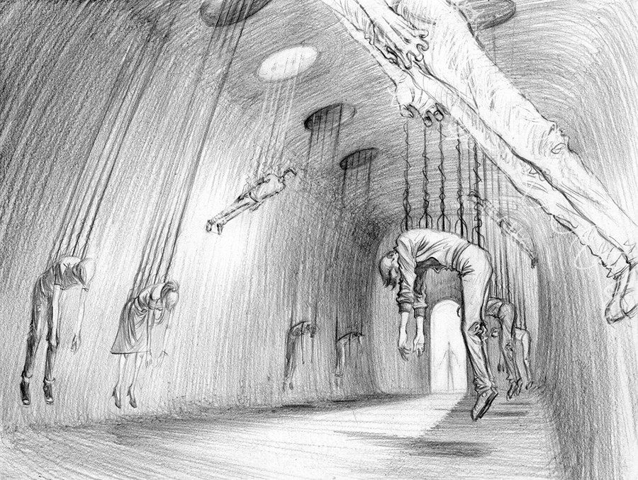
This is the "Abduction Chamber". Originally a form of generator room which has now been revamped to harness energy from a new source. Humans.  Each captive is attached via their spine and as the energy is extracted their bodies are left ridged while pulled upwards toward the ceiling.

Not exactly my kind of hobby, but hey, that's me.

- D
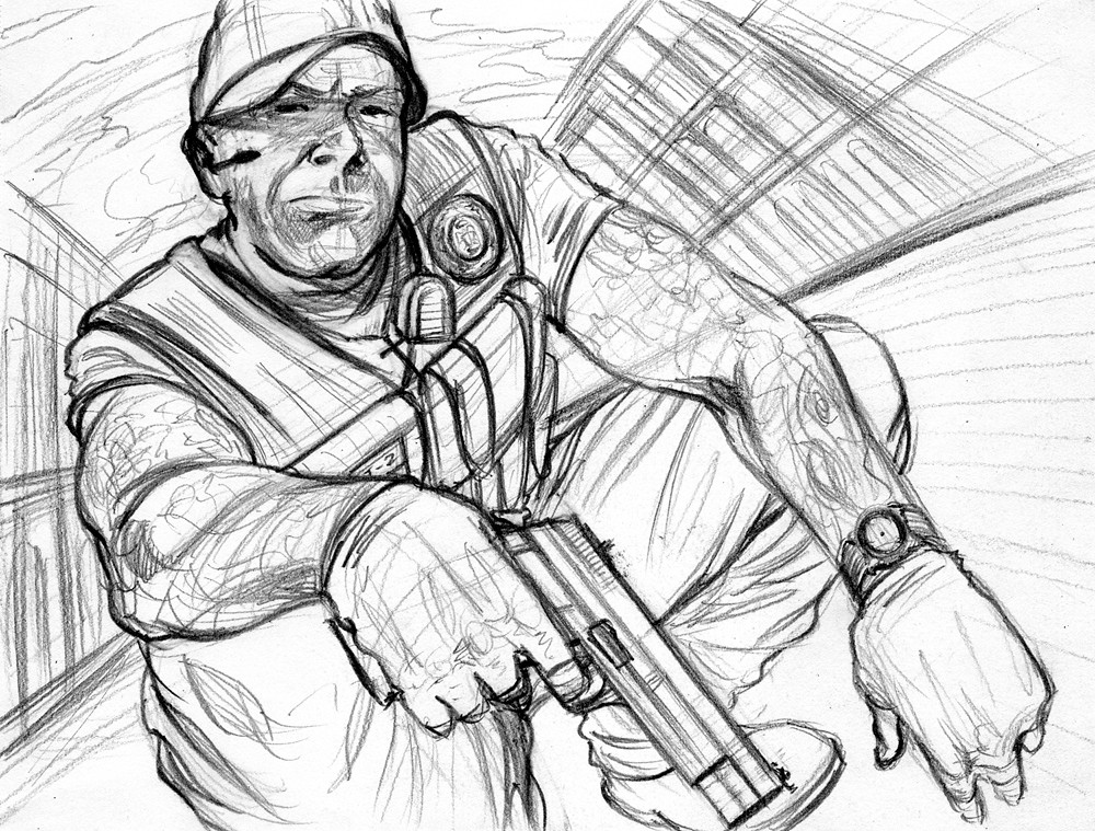
1 Comment

Big Easy Justice | Illustration the 4th "pencils"

9/19/2012

0 Comments

 
Picture
Whatsup everyone!

Here are the pencils for the 4th & final concept piece in the series done for Plastic Palm Tree, based on the television show BIG EASY JUSTICE on Spike.

These pieces were used in Plastic Palm Tree's pitch for the advertising of the show and were done before the show itself aired it's debut episode.


Next up are the inked finals of both the 3rd and 4th illustrations.  Hope you enjoy and I'll talk with you soon!

- D

0 Comments

Big Easy Justice | Illustration the 3rd "pencils"

8/31/2012

0 Comments

 
Picture
Whatsup eveyone, a good Friday to you all!  This piece here is the 3rd installment in a series of concept illustrations I did based on the new television series on Spike TV, BIG EASY JUSTICE.  These specific pieces were used as part of the advertising pitch for Plastic Palm Tree, a production company in Los Angeles.

This as you can see is the pencil stage of the illustration, which I later inked with brush & black india ink (be sure to keep your eyes on the lookout for said inked version, which I'll be posting in the coming days).

Hope you enjoy and I'll talk with you soon!

- D

0 Comments

Big Easy Justice | Spike TV

5/30/2012

3 Comments

 
Picture
Hey Whatsup everyone,

Here are a couple new illustrations I did for the award-winning LA based production company, Plastic Palm Tree.  These are concept pieces used in the creation of the advertising pitch for Spike TV's new show, Big Easy Justice, which just aired last month.

If you're not yet in the know on Big Easy Justice, it's a reality-based show about a bounty-hunter taking down the "bounty-hunted" in New Orleans.  I haven't seen the show myself but it looks like a lot of good tattooed cajun fun (in fact the guy's name is actually Tat-2).  You can check out more on Spike's website right
HERE.

Picture
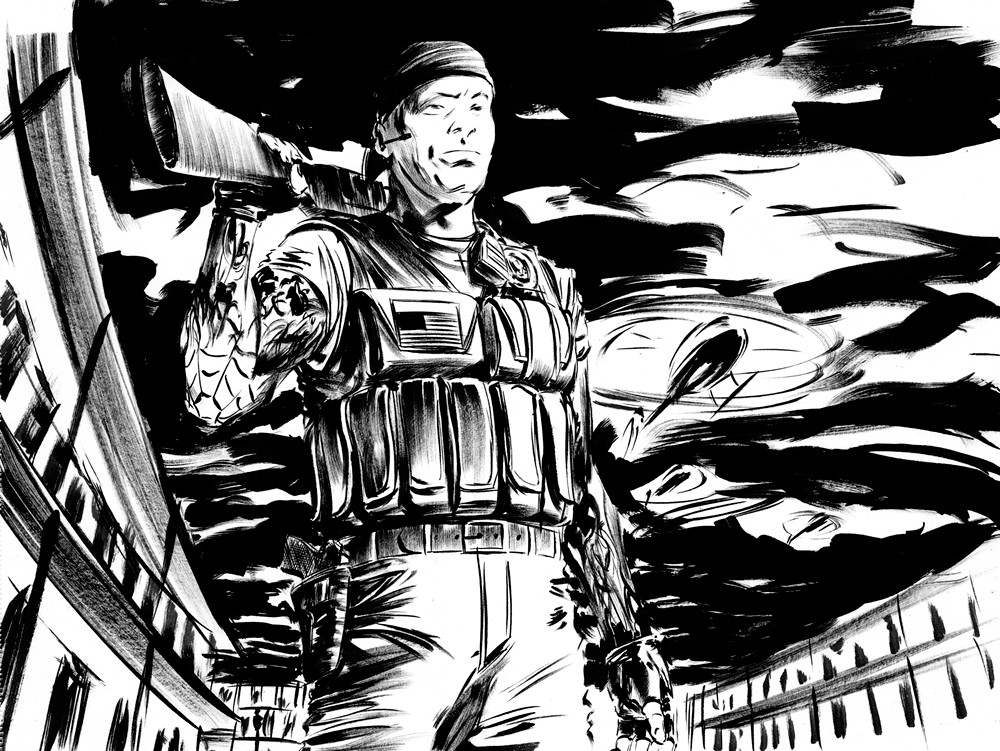
There are two other pieces in the series as well that I'll share over the next couple days, so keep your eyes peeled for those fellows.

If you'd like to see the completed Big Easy Justice ad designs by Plastic Palm Tree, as well as more of their impressive portfolio, you can do so on their website right
HERE (just click on "TV").

Hope you enjoy and I'll talk with you soon!

- Doug 

3 Comments

ADRIFT | Concept Piece - Part 3: Painting

12/19/2011

2 Comments

 
Picture
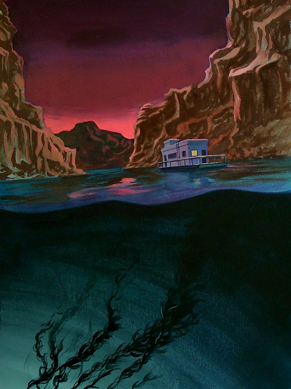
Whatsup ladies & gents, here we have the final stage of the ADRIFT concept piece...

As you may already be able to tell this is created using that weird substance known as "paint".  It's been quite a little while since I broke open the acrylics and gave them some attention so I thought this would be an opportune time to do just that.

I love working in color and I love working with paint, despite believing they're two of the most difficult areas of art-making, but from start to finish I had nothing but fun on this.  There's a curious quality to paint that allows it to just give a work life, especially if you've been on a black & white binge-fest.

So starting off I tried to keep the process as simple as possible - with laying the ground down, using simplified versions of the color scheme, and then as things progressed narrowing in on the details, the light laying on the various surfaces, the shadows that light casts, and any reflected light bouncing around.  Mix that together and this is what I came up with.

Hope you've all enjoyed this sneak-peak at my creative process and I'll talk with you soon.

- D

2 Comments

ADRIFT | Concept Piece - Part 2: Drawing

12/16/2011

3 Comments

 
Picture
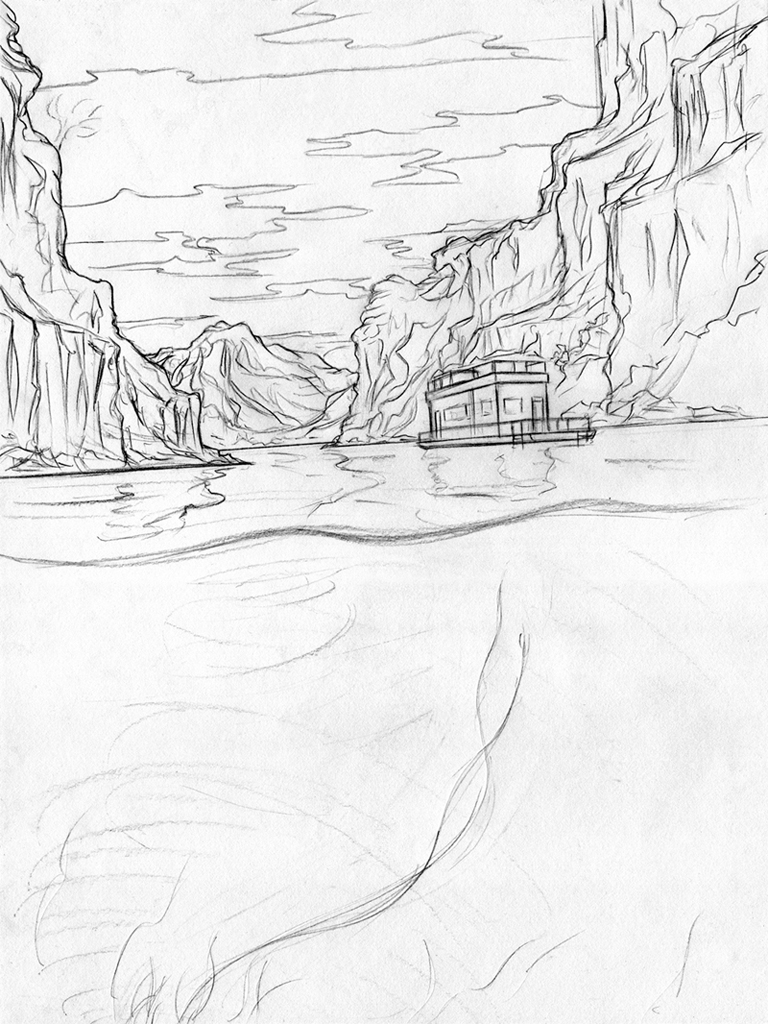
In this stage (part deux) the goal is to clarify the original sketch.  This is done in a few ways.  One is by cleaning up the line work and identifying where the light lands on each particular subject, as well as where the shadows fall.  Another area I bridge into is reference photos.  Not knowing precisely what the walls of a canyon look like or what the design of a 1950's house boat is I span the all powerful google, or any other resource, for answers.

I've also decided to move the composition up an inch or two to allow for room for the text that's to be included later on - an extremely important part of illustration (one I've learned the hard way a couple of times)

As you can see too I've left out the shading from the previous sketch.  The reason for this is that the "drawing" stage is meant to support the stage that follows.  By leaving the shading absent I find it easier to reproduce this stage into the next.  And it also allows for a sense of improvisation, which is incredibly important for keeping the image feeling fresh with vitality and life. Always a consistent goal.

Hope you enjoy and I'll back on Monday with the completed illustration,

- D

3 Comments

ADRIFT | Concept Piece - Part 1: Sketch

12/15/2011

2 Comments

 
Picture
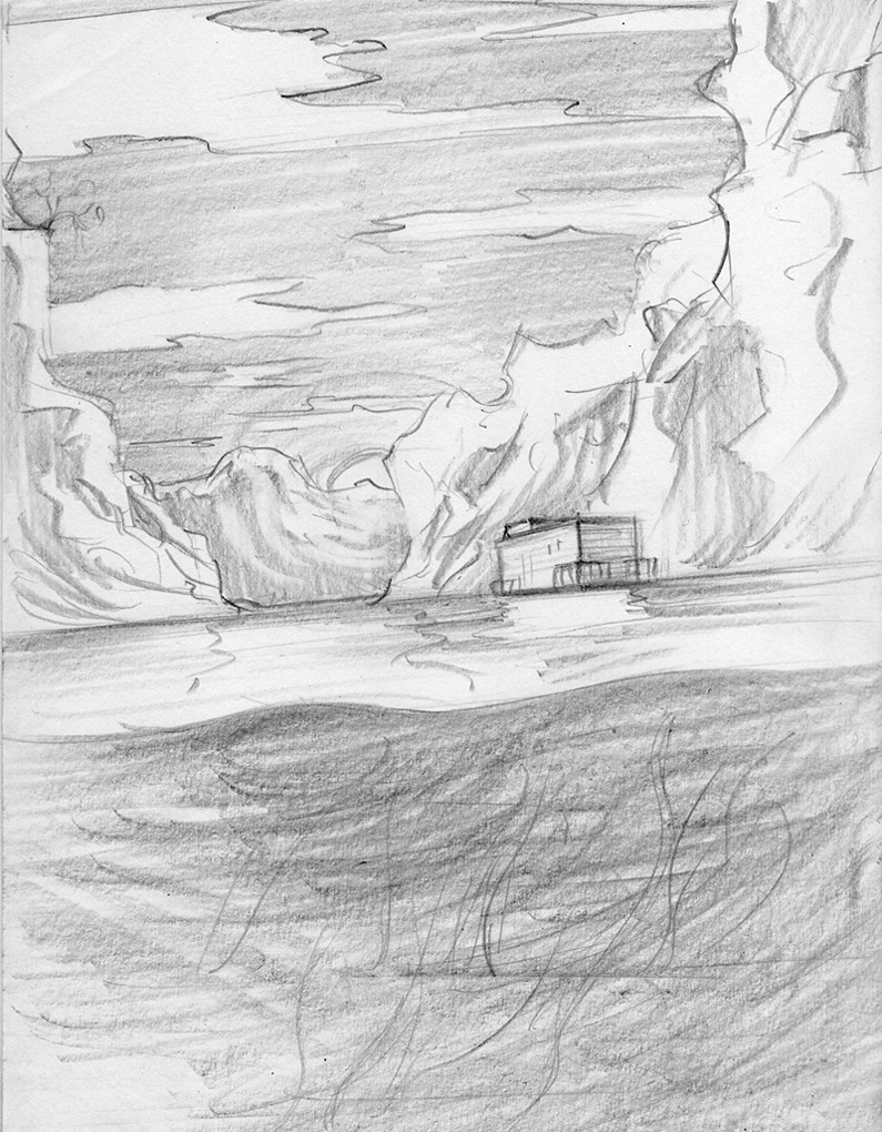
Over the next few days I've decided to post the process of a concept piece I did for the ADRIFT folks.  They wanted an image that summed up the mood & feel of the story and I was of course happy to oblige.  And starting off this series of images we first begin with the "sketch" phase.

For this project it's all about communication. Which goes for both the illustration itself and with those I'm collaborating with.  So, I do my best to keep those doors between the director/writer and myself as wide open as possible.  And for me this always starts with notes.

I do a lot writing before the sketch gets to paper because I want to retain as much detail as I can get from the image in my mind - and writing is the quickest way to get it out there. You can check out my notes based on Will & my conversation right HERE.

Then from there I move towards communicating those notes through quick pencil sketches - like the one we have here.

Hope you enjoy and I'll have part deux for you tomorrow,

-D


2 Comments

ADRIFT | Alien

11/22/2011

0 Comments

 
Picture

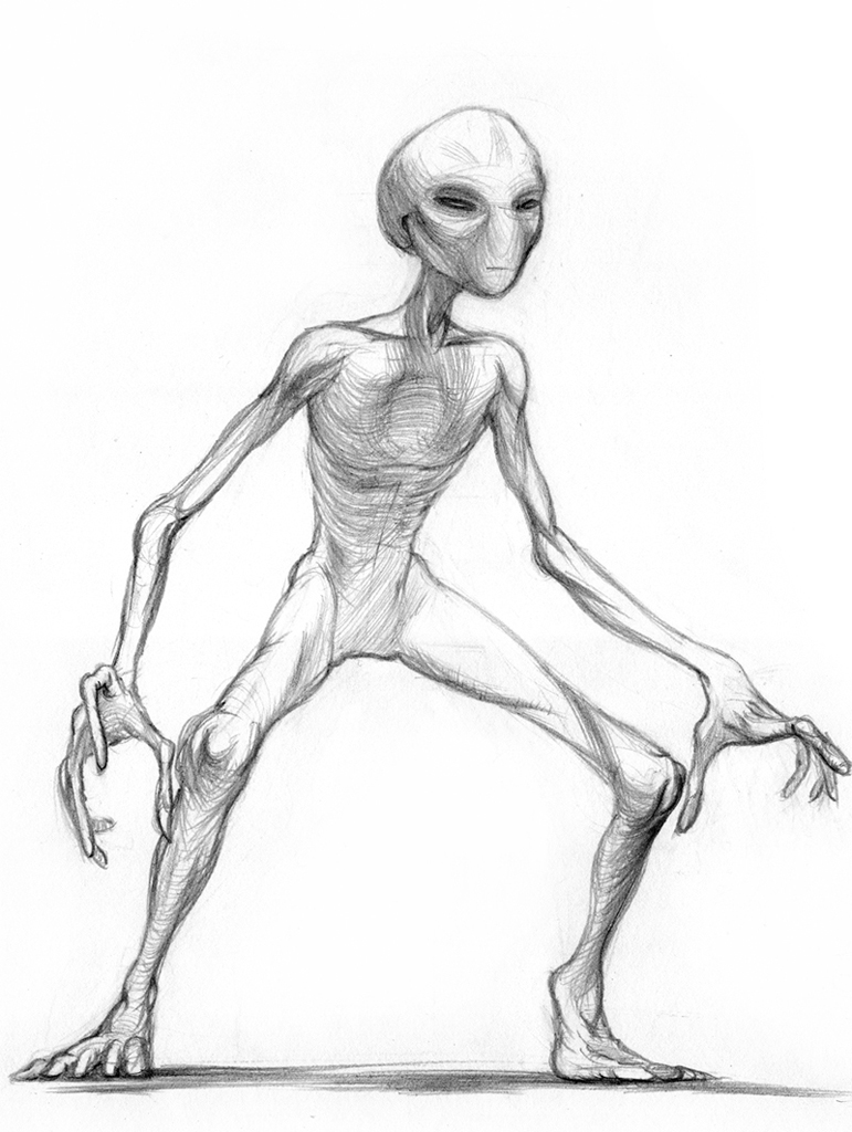
Whatsup everyone,

Here we have a friendly, or perhaps not-too-friendly (I'll never tell which) alien designed for the potential graphic novel & film ADRIFT.


This is actually the second design I came up with for our extraterrestrial character here.  The first was thinner, sporting a smaller head and was overall a bit more homo sapien in appearance.

After discussing it with Will & Joel it was decided we wanted to go with a more classic approach.  Something more traditionally science fiction and could easily match the era of the 1950's - when the story takes place.  And so, voilà!  This is what we came up with.

Hope you dig it and I'll talk with you soon,

- D
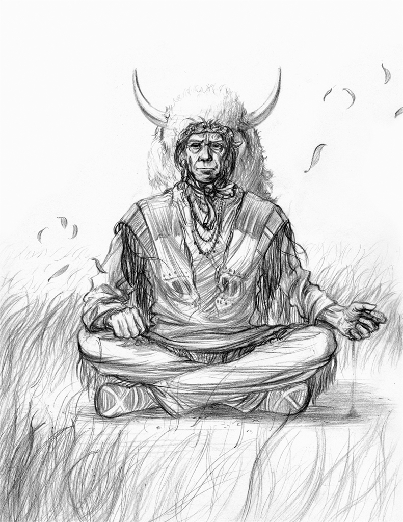


0 Comments

ADRIFT | Chief Nantan - part 4 (finale)

9/23/2011

0 Comments

 
Picture
Hey everybody,

First off, a happy Friday to you all.  It's actually raining where I'm at right now but it's kind of nice.  I enjoy working in doors when it's raining outside.  Something about the sound of the rain on the windows can really help your thoughts move easily.

Anyways, here we have it.  The final drawing of our good pal Nantan.  You may notice 
I focused just a bit more on light and shadow, this way the forms and shapes would come across as clearly as possible.  With a composition as symmetrical and straight on as this one it's important bring out those forms, as there aren't any other devices to help create depth and dimension.

More noticeably you'll see I've added more detail to his environment to try and capture some of the qualities I mentioned in the previous post regarding character - something that would aid in reflecting his personality.  A few leafs here, some grass there, a slight breeze and this is what we have.

Hope you guys dig it and I'll talk with you soon.  Have a great weekend!

- D

0 Comments
<<Previous

    Categories

    All
    Art Shows & Exhibitions
    Awards & Recognitions
    Childrens Books
    Conventions & Signings
    Film & TV
    Illustration
    Interviews
    Painting
    Panels & Workshops
    Process
    Reviews
    Sequential Art


    Archives

    May 2025
    April 2025
    March 2025
    February 2025
    January 2025
    December 2024
    November 2024
    October 2024
    September 2024
    July 2024
    June 2024
    May 2024
    April 2024
    March 2024
    October 2023
    February 2022
    November 2021
    August 2021
    July 2021
    June 2021
    May 2021
    April 2021
    March 2021
    February 2021
    January 2021
    November 2020
    October 2020
    September 2020
    August 2020
    July 2020
    June 2020
    May 2020
    April 2020
    March 2020
    February 2020
    January 2020
    December 2019
    November 2019
    October 2019
    September 2019
    August 2019
    July 2019
    June 2019
    May 2019
    April 2019
    March 2019
    February 2019
    January 2019
    December 2018
    November 2018
    October 2018
    September 2018
    August 2018
    July 2018
    June 2018
    May 2018
    April 2018
    March 2018
    February 2018
    January 2018
    March 2016
    February 2016
    December 2015
    October 2015
    October 2013
    May 2013
    April 2013
    February 2013
    December 2012
    November 2012
    October 2012
    September 2012
    August 2012
    July 2012
    June 2012
    May 2012
    April 2012
    March 2012
    February 2012
    January 2012
    December 2011
    November 2011
    October 2011
    September 2011
    August 2011
    July 2011
    June 2011
    May 2011
    April 2011
    February 2011
    January 2011
    December 2010
    November 2010
    October 2010
    September 2010
    August 2010
    July 2010
    June 2010
    May 2010
    April 2010
    January 2010
    December 2009


    ​© 2025 Douglas E. Draper Jr.
Powered by Create your own unique website with customizable templates.
  • POSTS
  • ARTWORK
  • ABOUT
  • PURCHASE
  • CONTACT